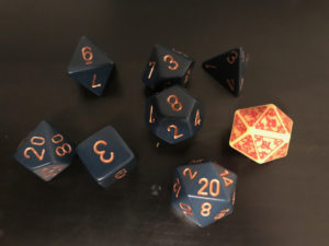
Tales of a GM is running the 12 Days of Dicember, a project dedicated dice in all their randomized glory. The question for the seven day of Dicember is “What is the best dice pattern?”
It depends on what what you mean by “best”. Overall, I’d say a high contrast dice pattern — dark die color with light lettering, for example — is best since everyone around the table can easily see the result.

By this measure, the worst dice are low contrast or “noisy”. Low-contrast dice have dice color and lettering that are too close to be easily discernible across the table. Noisy dice — ones with complex patterns and stylized or low-contrast lettering — are the worst. This often leads to dice that the player must pick up to read and — depending on the table — that can lead to accusations of cheating when someone “just happens” to keep rolling high numbers.
If by “best” we mean favorite dice, then my answer’s changed quite a lot over the years. In the early days I loved crystal dice, then moved to on to the softer-edged frosted dice. These days my favorite dice are elemental dice, which are fusion of two different colors. I picked up my first two sets of these at GenCon 2014 specifically to play Dungeons & Dragons 5th Edition and they are my go-to dice as a player.
I now have three sets:
- Red & Orange
- Green & Grey
- Blue and Grey
All three were made by Chessex.
Feature Image Meta
My elemental dice, which are my go-to dice for Dungeons & Dragons 5th Edition. Credit: Ken Newquist.


Hi Ken,
Readability is such a key factor in choosing dice. I tend to prefer white numbers, but it is the contrast which really matters. You example illustrates this point perfectly. I struggle with those “swirly” patterns which mix white and dark, rendering many of the numbers unreadable.
Thanks for sharing
Phil
Thanks for stopping by! I suspect that readability will become a bigger issue as we all get older. I’ve already had to break out the reading classes to read the 5e Player’s Handbook index (admittedly, that’s a really small font) and if I’m honest … it’s not just the index that has my squinting from time to time.