Tales of a GM is running the 12 Days of Dicember, a project dedicated to dice in all their randomized glory. The question for the first day of Dicember is “Which is your favorite set of dice?”
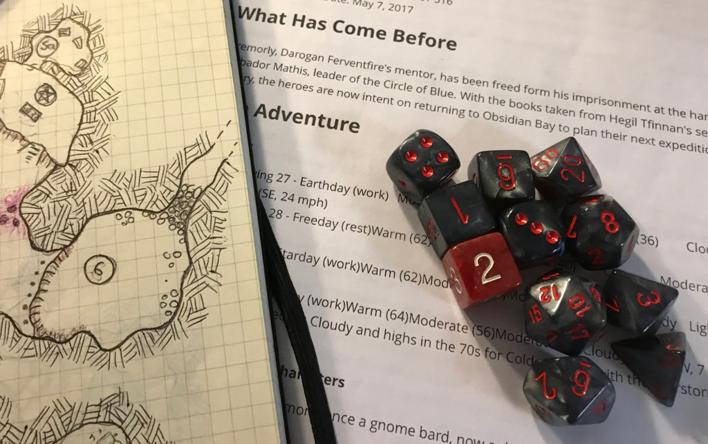
For me, it’s my Ragnarok dice. I bought these Chessex dice at MEPACON 2010 for my The Day after Ragnarok lunchtime campaign. The smokey grey and black dice with blood-red lettering fit the post-apocalyptic flavor, and adding a single red “wild die” made them perfect for the Savage Worlds game.

After adding a few more grey d6s to the mix, I went on to use them in our lunchtime Dragon Age playtest (with the red die now serving as the “dragon die”). They are now my go-to dice for convention games (mostly because of all the extra d6s and a spare d20) and Savage Worlds.
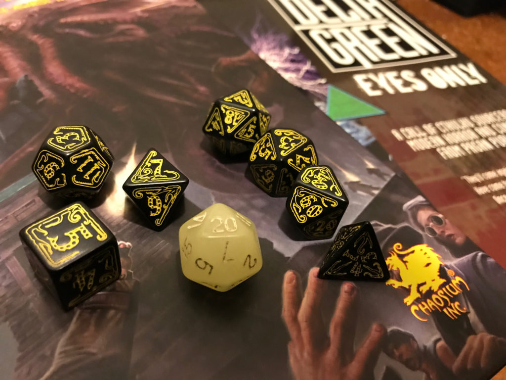
My runner-up choice is my yellow and black Cthulhu dice by Q-Workshop, which are augmented by my glow-in-the-dark d20. The glowy d20 is hated by my players for its propensity to roll critical hits and the Cthulhu d20 likely isn’t far behind it. They’re my go-to dice for our regular Dungeons & Dragons sessions (mostly because of the legends surrounding the glow-in-the-dark d20). Naturally, they’re also used for Call of Cthulhu and Delta Green, where the d20s sadly see far less action.

Feature Image Meta
A small portion of my dice hoard. Credit: Ken Newquist


Hi Ken,
Thanks again for taking part in The 12 Days of Dicember, and even broadening it out to two answers.
Those grey dice look great to use, with highly visible numbers. At my age, that is definitely a consideration. The Cthulhu dice look cool, but I would find the design too cluttered for my poor eyes.
Thanks for sharing
Phil
Depending on the lighting they can be hard to read, though not as hard as the Q-Workshop elven dice that I picked up. Thankfully the elder signs (the max values on those dice) really pop when they come up so you always know when you crit’d. I do have to say that dice legibility is something that I’m finding more and more important as I get older and fine myself relying on reading glasses during the game. Microfonts and poor contrast dice are definitely something I’m starting to avoid.